 "The Opponaut formerly known as MattP123" (mattp123)
11/17/2015 at 08:45 • Filed to: None
 2
2
 16
16|
"The Opponaut formerly known as MattP123" (mattp123)
11/17/2015 at 08:45 • Filed to: None | 2
| 16 |

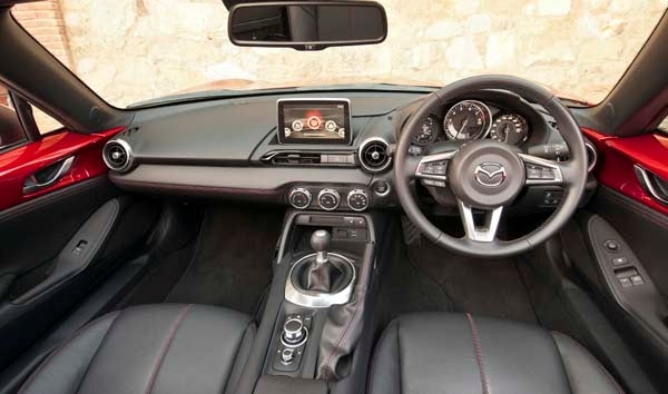
Would it kill you to make that one vent round like the others and center the screen over the center stack?
 CalzoneGolem
> The Opponaut formerly known as MattP123
CalzoneGolem
> The Opponaut formerly known as MattP123
11/17/2015 at 08:47 |
|
***triggered***
 C62030
> The Opponaut formerly known as MattP123
C62030
> The Opponaut formerly known as MattP123
11/17/2015 at 08:48 |
|
Oh God. That’s gonna bug me forever now.
 My citroen won't start
> The Opponaut formerly known as MattP123
My citroen won't start
> The Opponaut formerly known as MattP123
11/17/2015 at 08:52 |
|
I like how they managed to place everything off-center on purpose.
 RamblinRover Luxury-Yacht
> The Opponaut formerly known as MattP123
RamblinRover Luxury-Yacht
> The Opponaut formerly known as MattP123
11/17/2015 at 08:53 |
|
I get what they’re going for, I really do. But the infotainment screen in addition to being off-center absolutely ruins the “span with one vent on each end” thing they have going on, because it’s not centered on that, either, but makes it look like there should be two vents. Delete the infotainment screen and everything is much better.
 Jake - Has Bad Luck So You Don't Have To
> The Opponaut formerly known as MattP123
Jake - Has Bad Luck So You Don't Have To
> The Opponaut formerly known as MattP123
11/17/2015 at 09:01 |
|
That car looks like “off center” was the engineering mantra. Shifter? Off to the right. Vents? Fuck knows what’s going on there. Speedo? Off to the right. Infotainment? Right. Aaaaaaahhhhhhh
 Tripper
> The Opponaut formerly known as MattP123
Tripper
> The Opponaut formerly known as MattP123
11/17/2015 at 09:07 |
|
looks like that dash had one of its eyes poked out
 Sam
> The Opponaut formerly known as MattP123
Sam
> The Opponaut formerly known as MattP123
11/17/2015 at 09:11 |
|
Alternatively, make the round center vent like the other one, then move the infotainment to the left a bit.
 MontegoMan562 is a Capri RS Owner
> The Opponaut formerly known as MattP123
MontegoMan562 is a Capri RS Owner
> The Opponaut formerly known as MattP123
11/17/2015 at 09:15 |
|
OCD Car Owner Nightmare
 Milky
> The Opponaut formerly known as MattP123
Milky
> The Opponaut formerly known as MattP123
11/17/2015 at 09:22 |
|
Ohh no its asymmetrical!

 cletus44 aka Clayton Seams
> The Opponaut formerly known as MattP123
cletus44 aka Clayton Seams
> The Opponaut formerly known as MattP123
11/17/2015 at 09:24 |
|
Had a chance to talk to a Mazda designer about this when it launched. Apparently, the rationale behind it is that an unbroken line increases the impression of width. This is pretty important in a small car like the Mazda. Placing the screen lower would have broken that visual line he said.
 Patrick Nichols
> The Opponaut formerly known as MattP123
Patrick Nichols
> The Opponaut formerly known as MattP123
11/17/2015 at 09:31 |
|
I actually really like the style but as others mentioned I could do without the infotainment screen.
 and 100 more
> The Opponaut formerly known as MattP123
and 100 more
> The Opponaut formerly known as MattP123
11/17/2015 at 10:14 |
|
Would it kill you to make that one vent round like the others and center the screen over the center stack?
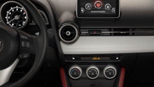
Can’t center the infotainment screen; the one round vent prevents it.

 RedPir8Roberts
> The Opponaut formerly known as MattP123
RedPir8Roberts
> The Opponaut formerly known as MattP123
11/17/2015 at 10:28 |
|
I see what you’re saying after taking a minute to find the middle, rectangular vent. The fact that the left vent is above the silver line while the other is aligned with it bothers me much more than the middle vent location or the fact the screen isn’t centered.
And now I see that the MX-5 has almost the same problem. Dammit. Not quite as bad, because of what they did with the more visible vent next to it, and the way the HVAC controls break the lower dash line, but still.
 davesaddiction @ opposite-lock.com
> The Opponaut formerly known as MattP123
davesaddiction @ opposite-lock.com
> The Opponaut formerly known as MattP123
11/17/2015 at 13:24 |
|
I like it.
|
The Opponaut formerly known as MattP123
> and 100 more
11/17/2015 at 13:33 |
|
Move it back towards the windshield...
 TheJMan92
> Sam
TheJMan92
> Sam
11/17/2015 at 15:44 |
|
I like this idea better, but then the one round vent on the right would be oddly out of place. Unless you can see the round vent on the far left.